
 by
by Timing the market can be very challenging at times. Peter Lynch says “ More money has been lost by the people who wait for corrections than by the people who stayed in the market”. True, because most cannot time the market perfectly. Behavioral issues, failure to identify the trend reversals are the main reasons for this. That is why it is said that the Bull market is the toughest to make money for an active investor.
However, as an active investor one should put in more effort and look into the trends of the market as a whole rather than just watching the moves of our invested stocks. If one thinks that they can be a consistent winner in the stock market just by chasing breakouts and chart patterns, they will be in for a rude shock in the years to come.
In this article, I am sharing my views on how one can keep track of global macro trends and take clues from the market to see the subtle changes that occur before a major move / rally. I will be discussing five key data points, one should take note of while spotting Trend reversals.
Remember that I don’t believe in that type of bottom fishing, where a trader takes a position just because the stock has gone to a 52 week low / or has fallen more than 40%. By bottom fishing I mean, taking cues from the market and getting a holistic view of trends, so that we can take calculated bets and benefit from them.
Let’s see them one by one:
Advance Decline Line:
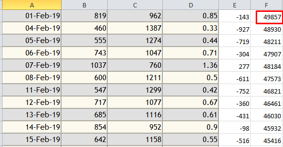
This approach is inspired from Stan Weinstein, a great trader who is underrated in my opinion. He advocates tracking AD lines. To track the AD line, first we should note down the daily advances and declines that happen each day. The daily data can be obtained from the NSE Website. Then the AD value can be calculated by subtracting the declines from the advances.
For example, if the advances for today are 1500 and declines are 800 then the AD data for today is 1500-800 = 300. Add this number to an imaginary large integer, say for example 50,000 (This helps in meaningful visualization of the graph, that will be explained later). Now the AD Data for that day is 50,300. (50,000 + 300).
Then if on the next day the advances are 700 and declines are 1600 then the AD data for that day is 700-1600 = -900. Add this number to the previous day value 50,300 + (-900) = 49400.
If you keep tracking this daily, within two to three months, you will have enough data to plot a chart in excel. If the line is declining then it means the market is getting weaker. If it is advancing then, it means the market is getting stronger.
Below image is the sample excel data of how I track the Advance / Decline:
See the chart below: The chart represents the AD line from October 2021 – August 30-2022. The AD line dropped to a new low in June 2022. From there, though the market is in a wide range only, there is a constant rise in the AD line (red arrow) for the past 5 months. Even it has broken the previous high pivot (Green Arrows).
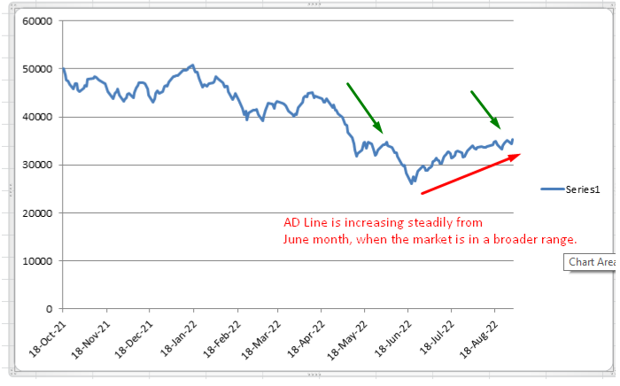
Note – One thing to keep in mind is that this AD line works well when looking for the data within the past 1-2 years. More than that, the graph will be a little skewed and is not much meaningful.
Nifty 50 Vs Gold Price:
The second key data point to be noted is the performance of Gold Vs Nifty 50 Index. Usually, there is a negative correlation between the equity index and Gold prices. Whenever the market is poorly performing Gold prices have seen a surge. Recent, covid fall is a clear example of how Gold shot up during the crash.
This is because, when the market is losing its grip, people tend to invest in hard assets like Gold, that are difficult to produce. Gold is a traditional investment option usually considered to be safe, compared to currencies like Dollar / INR.
See, the image below:
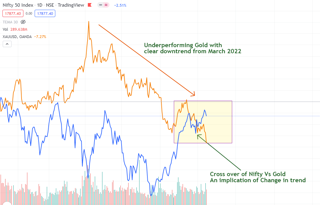
This is a representation of the chart of Nifty 50 (Blue line) Vs Gold (Orange line) from October 2021. See the negative correlation. As you can see, when the Nifty 50 topped out, there started the outperformance of Gold. Till March 2022 the Gold prices continued to rise, after which it started to decline. Now, as of today (September 2022), the cross over (Yellow rectangle) is taking place, where the Nifty performance is surpassing the Gold.
This gives a sign of emerging strength in Nifty in a gradual manner.
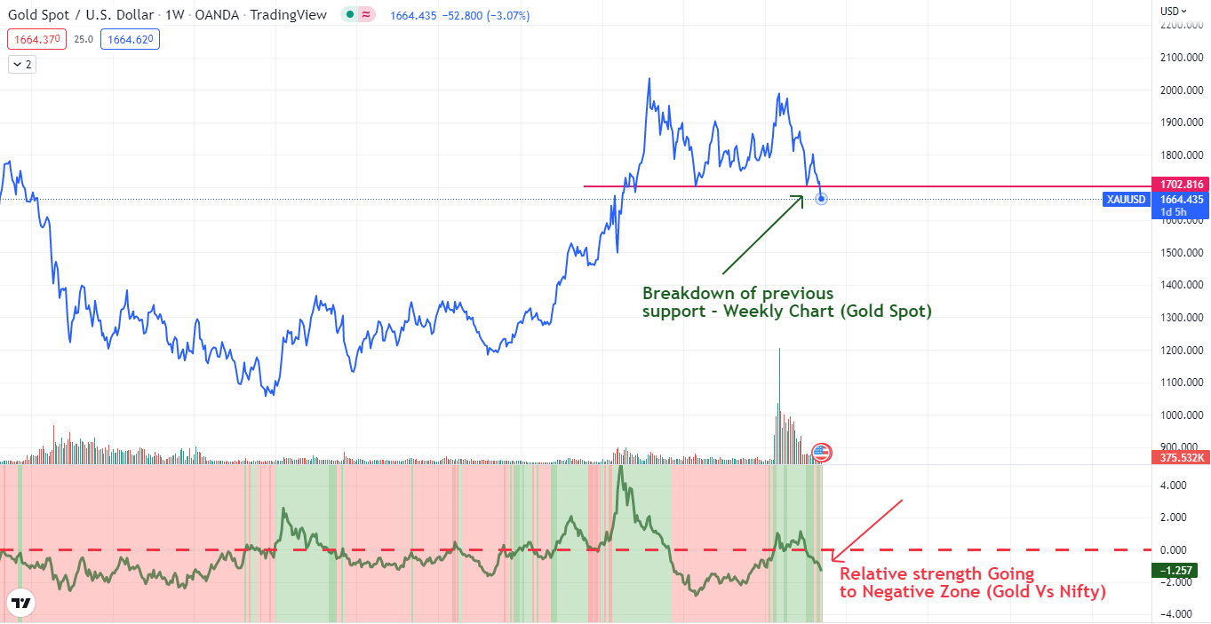
Also, see the Relative strength of Gold going into negative territory when compared to the Nifty Index in the image below:
Note: Even though Gold and Nifty usually move in opposite directions, at times when the market is very volatile, it will be difficult for the investors to be certain. This uncertainty may cause a slow upward move in both equity and Gold. Because some will be betting on equities while some will be investing in hard assets like Gold, expecting a crash. Also, on specific occasions when the economy is booming, it is possible for Gold and Nifty to move together.
Nifty 50 Vs India Vix:
The next important key point is India Vix’s (Volatility Index) performance against Nifty 50. Vix denotes the volatility and when the fear in the investors are high the Vix also rises.
We already know that India VIX has a negative correlation with Nifty. So, if the performance / strength of India VIX is greater than the Nifty 50 benchmark then we can consider that Nifty is in a downward movement or a consolidated movement. Vice versa is also true.
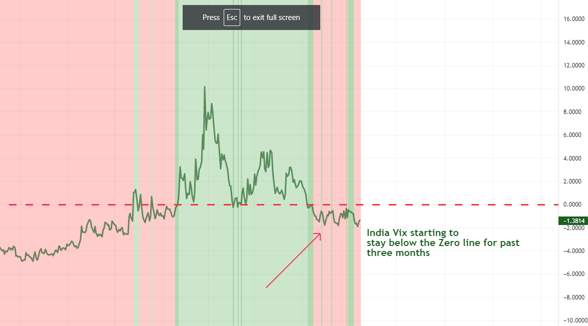
See the image below:
The image shows the performance of India Vix plotted against Nifty 50. See that after staying in the positive zone from Jan 2022 – June 2022, the Vix has steadily moved down to the negative zone (red arrow) from July 2022 and is still staying in the negative zone.
This is a clear signal that the investors are not in fear and are confident. This is the time when the professionals start accumulating and we should be narrowing our focus to pick up the leading sectors. Sector timing is very important to grow our account 2X faster.
If someone wants to know more about Indian Vix, read my article on India VIX and Relative Strength Correlation – How to play in Short and Long Term? (An Analysis)
Nifty 50 Vs Crude Oil prices:
Though the correlation between Crude prices and equity market is confusing and is not consistent, in the current cycle it does play a role. Inflation is high everywhere, reaching new highs day by day. Rising inflation is never a good sign as it reduces the value of money which again will impact the equity market.
Also, crude plays an important role in high inflation. If the inflation has to come under control definitely crude prices should be kept in check. So, in this cycle, decreasing crude prices is considered to be good for the market.
See the image below:
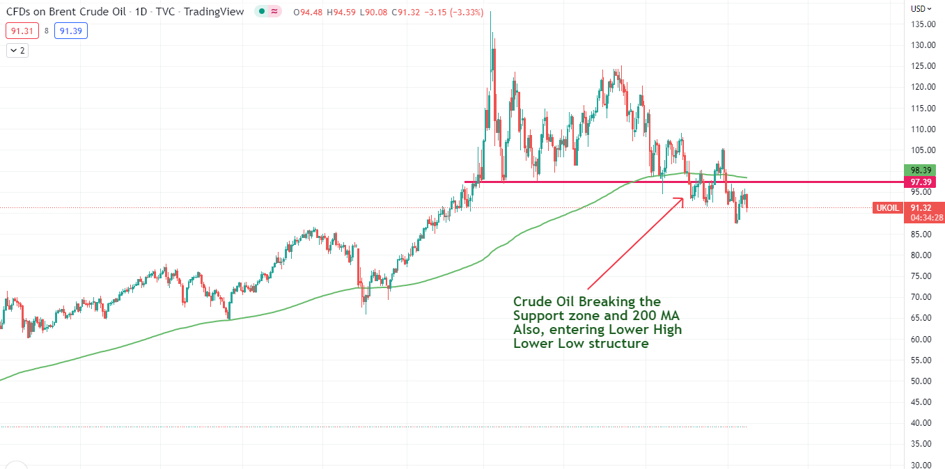
Crude prices going below the 200 day moving average and also entering into Lower High- Lower Low structure.
Nifty 50 Vs Global Indices:
This is the final key data point I would like to address in this article. The above four data points showed a positive cue that the bull market is coming up and the trend is reversing. However, the trend can sustain only if it is supported by the global markets.
US market, European market, German market, Emerging Asian Market all play an important role in the healthy bull run of Nifty. Nifty running alone when other markets are bleeding is a rare phenomenon. This is the only cue that is worrisome as of now. If you see the below charts, all the global markets are in very poor structure when Nifty 50 is very near to All Time High.
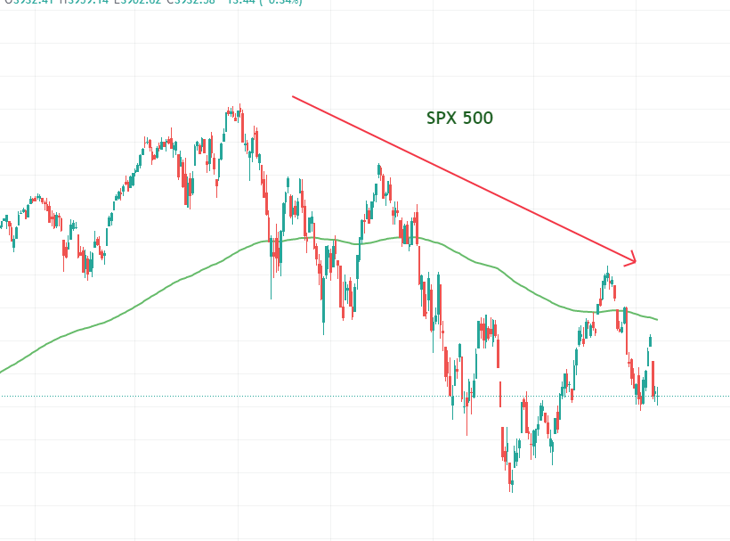
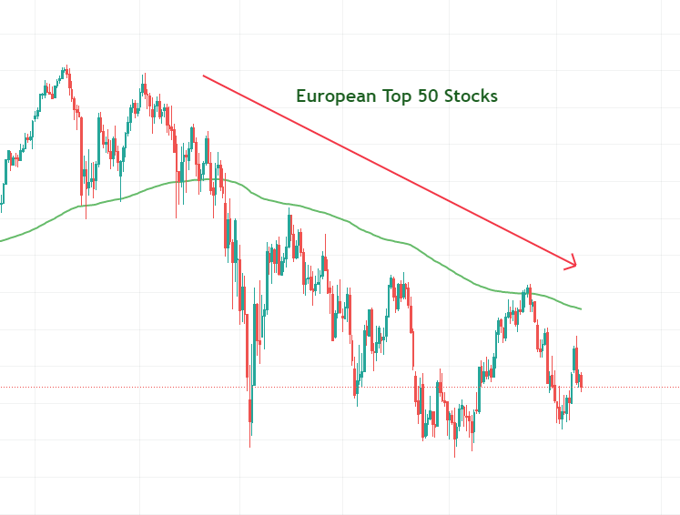
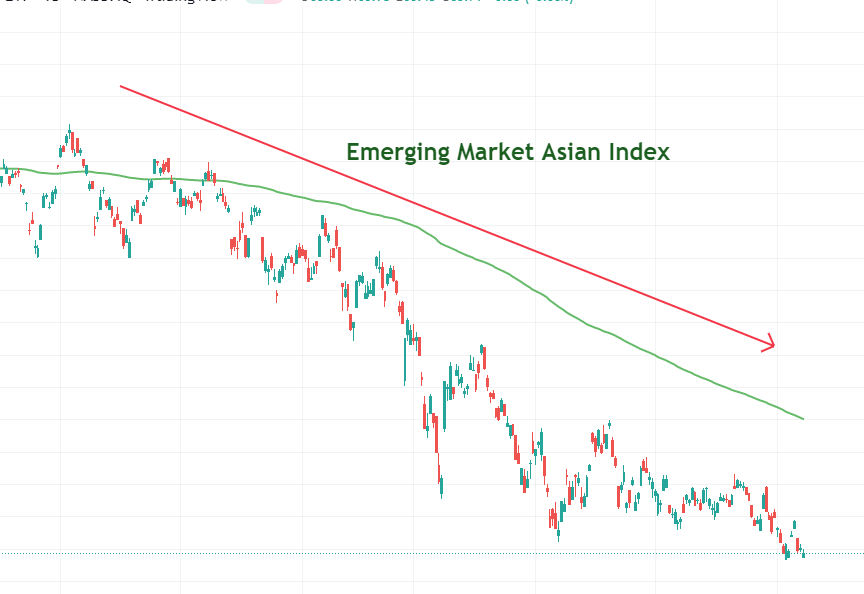
As you can see, all these global indices (Daily Charts) are in a very poor structure and are well below their 200 day Moving Averages. This is definitely a reason to worry. We have to see whether the global markets are going to form a base and move up from here or there is going to be another leg down.
Conclusion:
- We have seen the five key data points and how to take cues from macroeconomics and use it for our investing journey.
- Though, there is a subtle change in the downtrend and the Indian market seem to be becoming stronger, the global markets should pick up, if the bull run has to sustain.
- Keeping a close track on these data points, in the coming days will help us to make informed decisions.
- If you are an active investor, with money in your Demat account sitting idle, consider parking it in Liquid bees and in meantime wait for the proper entry, in proper sectors.
- Keep the position sizing calculations ready and jump into the position when the time comes.
- If you are a passive investor, just take note of these data points with a pinch of salt and continue doing your SIPs. Make sure your goal is long term.
- Do note that the views expressed in this article are my personal views and I may be wrong. Do your own analysis before investing.
Consider subscribing to my newsletters if you like my writings. Happy Investing!!!

Was it helpful?
You can consider subscribing to the newsletters if you like my writings and want my insights delivered right in your inbox.


2 thoughts on “Love Bottom Fishing in Stock Market? (Track these Five Key data points to identify Trend Reversals)”